The R programming language is great for making scientific figures, especially using the ggplot2 library. In this post, we show a few plot examples, over a publicly available dataset on driving car CO2 emissions in France. The code that generated each figure will be provided and explained.
The dataset
The dataset used to draw the figures is about CO2 emissions of driving cars available in France, and is publicly available on public.opendatasoft.com. You can quickly download it with the following command:
wget https://public.opendatasoft.com/explore/dataset/vehicules-commercialises/download/?format=csv&timezone=Europe/Berlin&lang=fr&use_labels_for_header=true&csv_separator=%3B
The dataset is a csv file that has about 300,000 rows and 26 variables. Each row corresponds to a car, with its attributes. Note that this is not a sale dataset, so we do not know how many cars were sold each year. We only have informations on every available cars between the years 2005 and 2015.
R librairies
We used the following librairies to generate the figures:
- dplyr: for easy data manipulation.
- ggplot2: for drawing the figures
- ggfittext: for labeling figures
- ggridges: for drawing Ridgeline charts
- hrbrthemes: for additional themes
to be used in
ggplot2. - ggstream: to draw stream graphs
After installing the libraries, we import them in our R script:
library(dplyr)
library(ggplot2)
library(ggfittext)
library(ggridges)
library(hrbrthemes)
library(ggstream)
Drawing the figures
All the code used to draw the following figures is publicly available in this github repository: ericdaat/dataviz-examples-in-R.
I like to start my R script with configuration variables, that will
be used in every plot I draw. We set the base size for every plot and
the dpi for exporting the figures in png with ggsave. We then create
several themes that we will reuse in our plots. These themes are list
variables, where we can add ggplot components. Instead of using the default
ggplot themes, we use the ones from the
hrbrthemes package. Plots drawn
using this theme look very modern and compact. Moreover, their color
palette is very elegant. The default_theme variable is simply the
theme_ipsum_rc, where we set the base size, title size and axis title size
parameters. In the flipped_theme variable we added a coord_flip and
thousand separator on the y scale. The non_flipped_theme is the same setup,
but without coord_flip(). Also, we only draw a single grid, either on the
x axis or the y axis, I like it better when it’s minimalist, but that’s
my opinion, feel free to change that if you wish.
BASE_SIZE <- 12
DPI <- 100

default_theme <- list(
  theme_ipsum_rc(grid = "X",
                 base_size = BASE_SIZE,
                 plot_title_size = BASE_SIZE + 2,
                 axis_title_size = BASE_SIZE + 1)
)

flipped_theme <- list(
  coord_flip(),
  theme_ipsum_rc(grid = "X",
                 base_size = BASE_SIZE,
                 plot_title_size = BASE_SIZE + 2,
                 axis_title_size = BASE_SIZE + 1),
  scale_y_continuous(labels=function(x) format(x,
                                               big.mark = ",",
                                               scientific = FALSE))
)

non_flipped_theme <- list(
  theme_ipsum_rc(grid = "Y",
                 base_size = BASE_SIZE,
                 plot_title_size = BASE_SIZE + 2,
                 axis_title_size = BASE_SIZE + 1),
  scale_y_continuous(labels=function(x) format(x,
                                               big.mark = ",",
                                               scientific = FALSE))
)
We start with some bar plots, to describe absolute numbers like the number of cars by brand; or relative numbers, like the percentage of cars by line (luxury, economy, …).
Regular bar chart
A very basic bar chart. I like to use coordinate flip, as it is easier to read the labels when they are horizontal. Also do not forget to add the numbers as labels, and sort the bars by descending order.
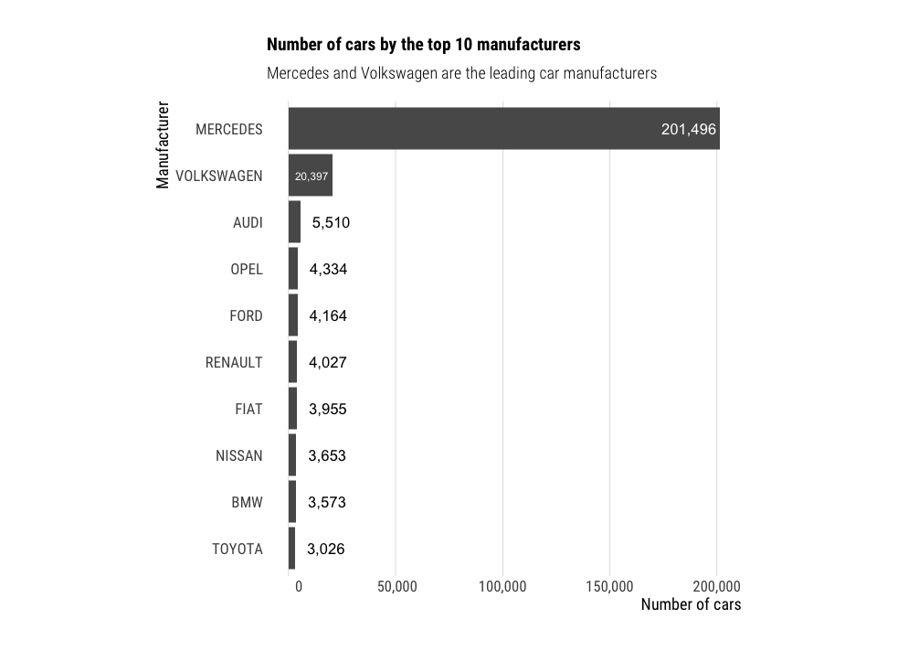
 df %>%
  group_by(Marque) %>%
  summarise(n=n()) %>%
  top_n(n=10, wt=n) %>%
  ggplot(aes(x=reorder(Marque, n),
             y=n,
             label=format(n, big.mark = ","))) +
    geom_bar(stat="identity") +
    geom_bar_text() +
    flipped_theme +
    theme(aspect.ratio = 1) +
    labs(title="Number of cars by the top 10 manufacturers",
         subtitle = "Mercedes and Volkswagen are the leading car manufacturers",
         y="Number of cars",
         x="Manufacturer")
Stacked bar chart
When visualizing proportions instead of actual numbers, stacked bar charts are indicated. Here, we kept the same order than in the previous chart, and filled the bars by car categories. The labels show the percentage of cars manufactured, by brand and category.
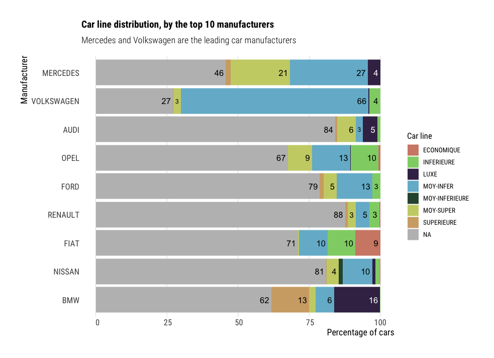
df %>%
  group_by(Marque, Gamme) %>%
  summarise(n=n()) %>%
  group_by(Marque) %>%
  mutate(total=sum(n),
         ratio=100*(n/total)) %>%
  filter(total>3200) %>%
  ggplot(aes(x=reorder(Marque, total),
             y=ratio,
             fill=Gamme,
             label=round(ratio, 0))) +
    geom_bar(stat="identity") +
    geom_bar_text(position = "stack", place="right") +
    scale_fill_ipsum(na.value="grey") +
    flipped_theme +
    labs(title="Car line distribution, by the top 10 manufacturers",
         subtitle = "Mercedes and Volkswagen are the leading car manufacturers",
         y="Percentage of cars",
         x="Manufacturer",
         fill="Car line")
Another example of stacked bar chart:
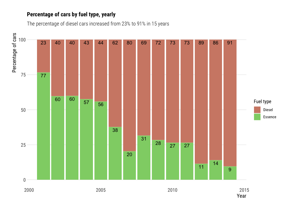
df %>%
  filter(Carburant %in% c("Essence", "Diesel")) %>%
  group_by(Année, Carburant) %>%
  summarise(n=n()) %>%
  group_by(Année) %>%
  mutate(total=sum(n),
         ratio=100*n/total) %>%
  ggplot(aes(x=Année,
             y=ratio,
             fill=Carburant,
             label=round(ratio))) +
  geom_bar(stat="identity") +
  geom_bar_text(position="stack", place="top") +
  non_flipped_theme +
  scale_fill_ipsum(na.value="grey") +
  labs(title="Percentage of cars by fuel type, yearly",
       subtitle = "The percentage of diesel cars increased from 23% to 91% in 15 years",
       y="Percentage of cars",
       x="Year",
       fill="Fuel type")
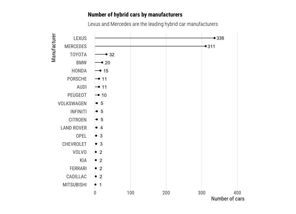
Lollipop chart
Lollipop charts are a nice alternative to regular barplots, as they look less crowded.
df %>%
  filter(Hybride=="Hybride") %>%
  group_by(Marque) %>%
  summarise(n=n()) %>%
  ggplot(aes(x=reorder(Marque, n),
             y=n,
             label=format(n, big.mark = ","))) +
  geom_point() +
  geom_segment(aes(x=reorder(Marque, n),
                   xend=reorder(Marque, n),
                   y=0,
                   yend=n)) +
  geom_text(hjust=-.25) +
  flipped_theme +
  theme(aspect.ratio = 1) +
  ylim(0, 400) +
  labs(title="Number of hybrid cars by manufacturers",
       subtitle = "Lexus and Mercedes are the leading hybrid car manufacturers",
       y="Number of cars",
       x="Manufacturer")
Histograms
When visualizing continuous distributions, work well. You might use a kernel density plot (KD) to show the probability distributution rather than the absolute numbers. I personally prefer the plain histograms with absolute numbers, and find them easier to read. Plus KD plots might create data where there is none.
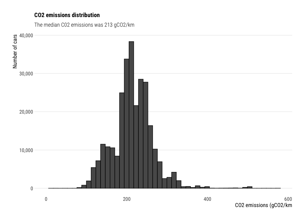
df %>%
  ggplot(aes(x=CO2)) +
  geom_histogram(bins=50,
                 color="black") +
  non_flipped_theme +
  xlim(0, NA) +
  labs(title="CO2 emissions distribution",
       subtitle="The median C02 emissions was 213 gCO2/km",
       x="CO2 emissions (gCO2/km",
       y="Number of cars")
Ridgeline charts
Histograms become less intuitive when we want to display multiple variables. For instance, what if we wanted to visualize the CO2 emissions distribution per car category ? Ridgeline charts solve this by showing multiple kernel density plots multiple x axis. The package ggridges is my personal favorite for drawing these plots.
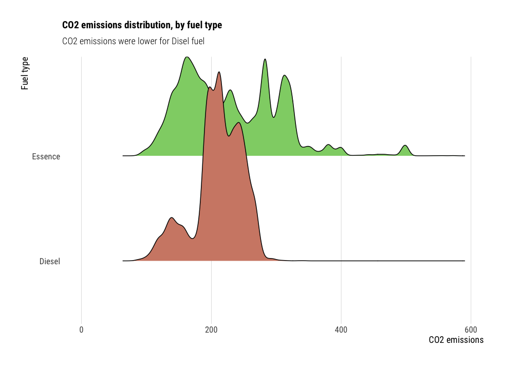
df %>%
  filter(Carburant %in% c("Essence", "Diesel")) %>%
  ggplot(aes(x=CO2,
             y=Carburant,
             fill=Carburant)) +
    geom_density_ridges(show.legend = F) +
    default_theme +
    scale_fill_ipsum() +
    xlim(0, NA) +
    labs(title="CO2 emissions distribution, by fuel type",
         subtitle="CO2 emissions were lower for Disel fuel",
         x="CO2 emissions",
         y="Fuel type")
Violin charts
Violin charts are a nice alternative to box plots, for comparing distributions from multiple variables. For instance, in the following plot, we study the car consumption distribution per year. Violin charts look better when there is enough data to show. However, they do not show the median as box plots do, so it is less easy to compare the distributions together.
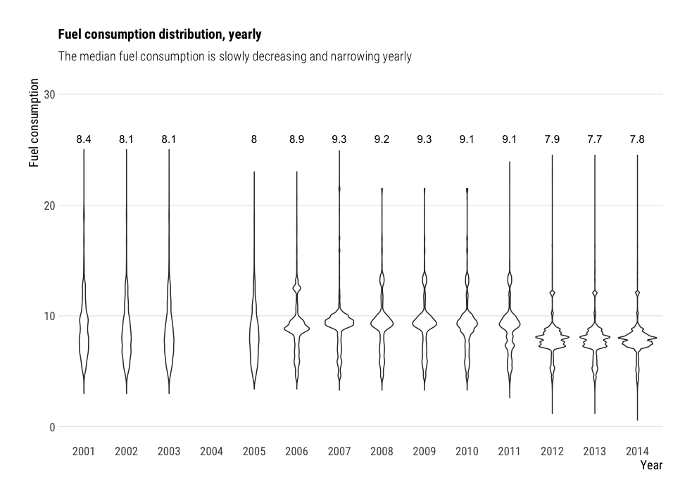
df %>%
  ggplot(aes(x=as.factor(Année),
             y=Consommation.mixte)) +
    geom_violin() +
    geom_text(data = df %>%
                group_by(Année) %>%
                summarise(median=median(Consommation.mixte, na.rm = T)),
              aes(x=as.factor(Année),
                  y=26,
                  label=round(median, 1))) +
    non_flipped_theme +
    ylim(0, 30) +
    labs(title="Fuel consumption distribution, yearly",
         subtitle = "The median fuel consumption is slowly decreasing and narrowing yearly",
         y="Fuel consumption",
         x="Year")
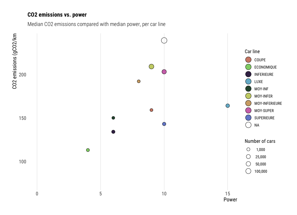
Bubble charts
Bubble charts are a variation scatter plots, where both x and y axis
display continuous data. The color and size of the points can encode
additional variables too, which is makes them very handy to show many
variables on a single plot. However, be careful not to overdo it, as the more
variables are displayed, the less intuitive the plot becomes. On the
following plot, we compared median CO2 emissions (y axis) with median power
(x axis). The points are colored by car category, and sized by the number of
cars in this category.
df %>%
  group_by(Gamme) %>%
  summarise(n=n(),
            median_power=median(Puissance.administrative, na.rm=T),
            median_CO2=median(CO2, na.rm = T)) %>%
  ggplot(aes(x=median_power,
             y=median_CO2,
             size=n,
             fill=Gamme)) +
    geom_point(shape=21) +
    xlim(0, NA) +
    ylim(75, NA) +
    default_theme +
    scale_fill_ipsum() +
    scale_size_continuous(breaks = c(1000, 25000, 50000, 100000),
                          range = c(3, 6),
                          labels=function(x) format(x,
                                                    big.mark = ",",
                                                    scientific = FALSE)) +
    guides(fill=guide_legend(override.aes = list(size = 6))) +
    labs(title="CO2 emissions vs. power",
         subtitle="Median CO2 emissions compared with median power, per car line",
         x="Power",
         y="CO2 emissions (gCO2/km",
         size="Number of cars",
         fill="Car line")
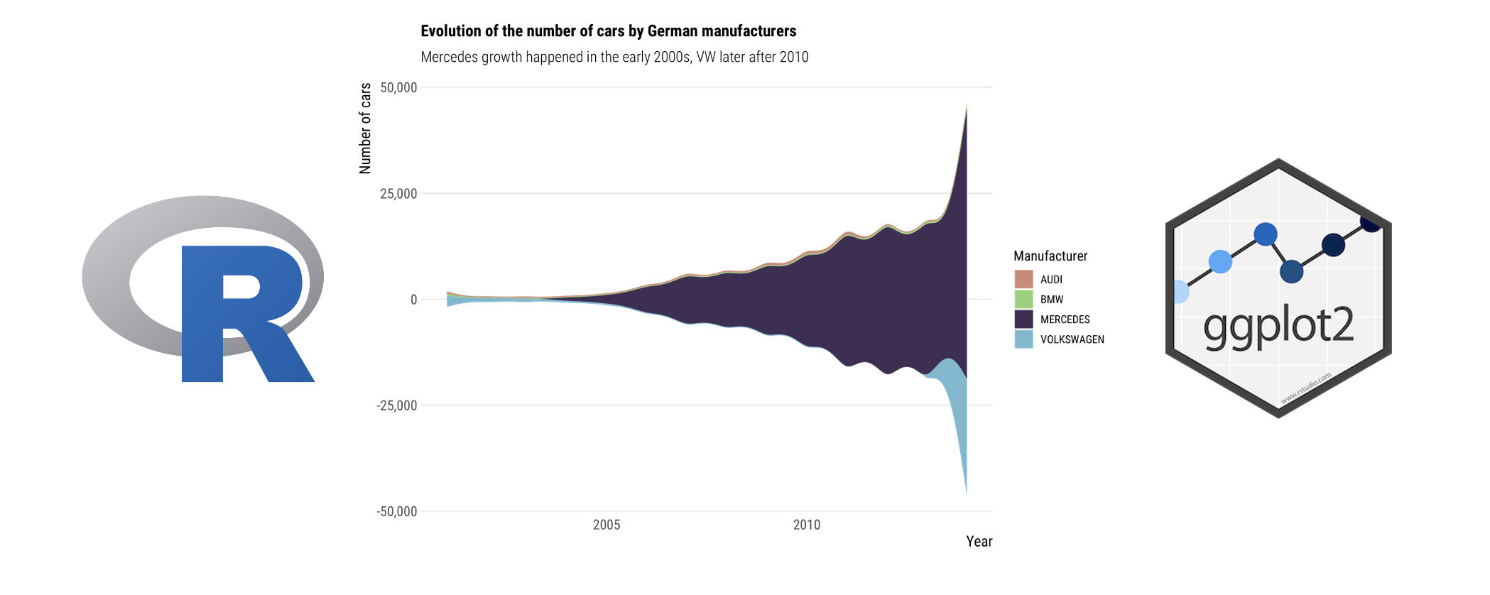
Streamgraph charts
A streamgraph is a type of stacked area chart. It represents the evolution of a numeric variable for several groups. The ggstream package makes it easy to bring streamgraphs to ggplot.
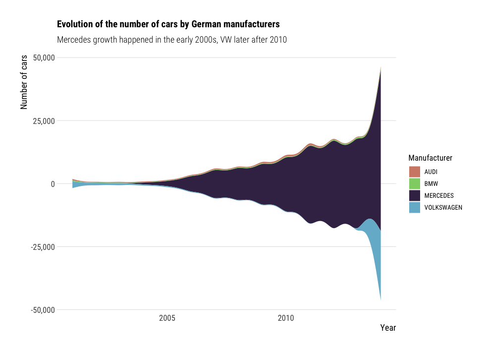
df %>%
  filter(Marque %in% c("AUDI", "BMW", "MERCEDES", "VOLKSWAGEN")) %>%
  group_by(Année, Marque) %>%
  summarise(n=n()) %>%
  ggplot(aes(x=Année,
             y=n,
             fill=Marque)) +
    geom_stream() +
    non_flipped_theme +
    scale_fill_ipsum() +
    labs(title="Evolution of the number of cars by German manufacturers",
         subtitle="Mercedes growth happened in the early 2000s, VW later after 2010",
         x="Year",
         y="Number of cars",
         fill="Manufacturer")
Further reading and resources
This short blog post is not a comprehensive guide for data visualization.
It simply aimed at providing a few snippets and ideas for tweaking your
ggplot figures. Simple additions like themes or color palettes could
turn your average plots into beautiful figures, in only a couple of lines of
code.
Here are some useful websites I use a lot when drawing figures:
- The R Graph Gallery: plenty of inspiration and code snippets for drawing beautiful figures in R.
- Dataviz inspiration: aims at being the biggest list of chart examples available on the web
- From data to viz: From Data to Viz leads you to the most appropriate graph for your data.
- Coolors.co: for many examples of color palettes.
- The Fundamentals of Data Visualization book by Claus O. Wilke
- The Storytelling with data book by Cole Nussbaumer Knaflic
I hope these code snippets were useful. Don’t forget to have a look at the full code on my github repository: ericdaat/dataviz-examples-in-R. Please let me know in the comments if it was helpful or if there was any bug, and happy coding !